Type:
Product strategy
Service design
Services:
Product workshops
Customer interview
Product strategy
Information architecture
UX & content strategy
Service design
Revenue modeling
Driver Inc.
The cure for cancer treatment
In 2010, only 3% of cancer patients enrolled in clinical trials while 60% of clinical trials failed to meet minimum patient enrollment. Despite increased research and investment in developing cancer treatments, there has been minimal change in how patients access these treatments. Driver is a product specifically designed to connect patients globally with advanced treatments.
As the Lead Product Strategist and Product Manager at Your Majesty, I led the transformation of Driver’s proprietary engine into a comprehensive suite of consumer-facing products. This suite includes a clinician’s app, a patient app, and several additional tools.
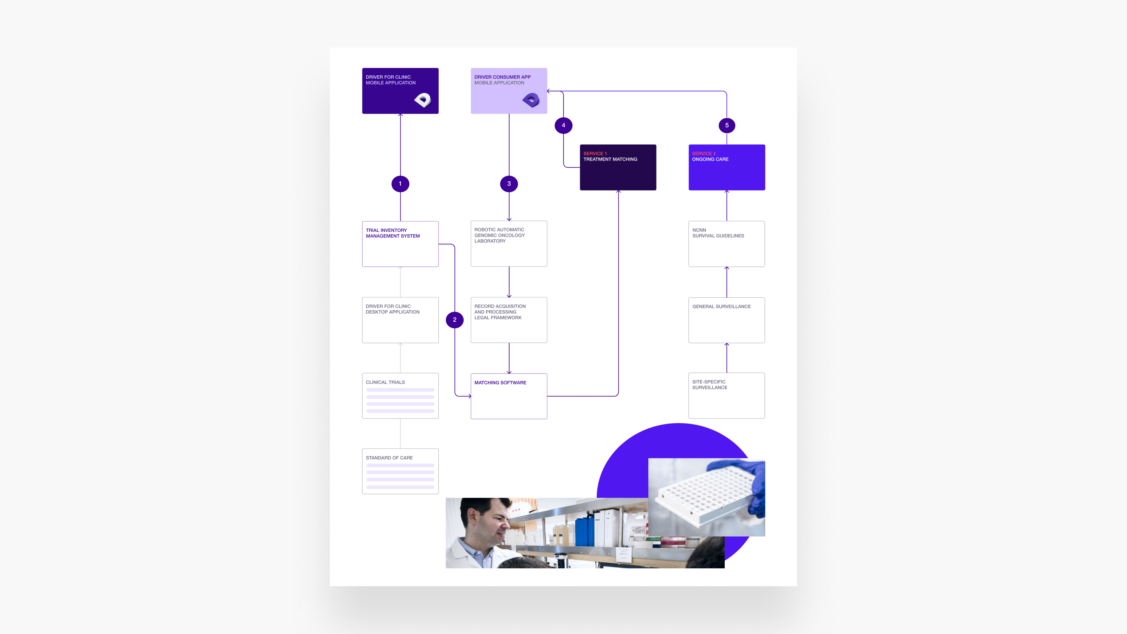
Mapping the product ecosystem
At the outset of the project, it was evident that there was a need to transform Driver’s sophisticated software into a range of consumer-facing products. To create a comprehensive blueprint of how these products interact and collectively deliver Driver’s services, I mapped out its product ecosystem.
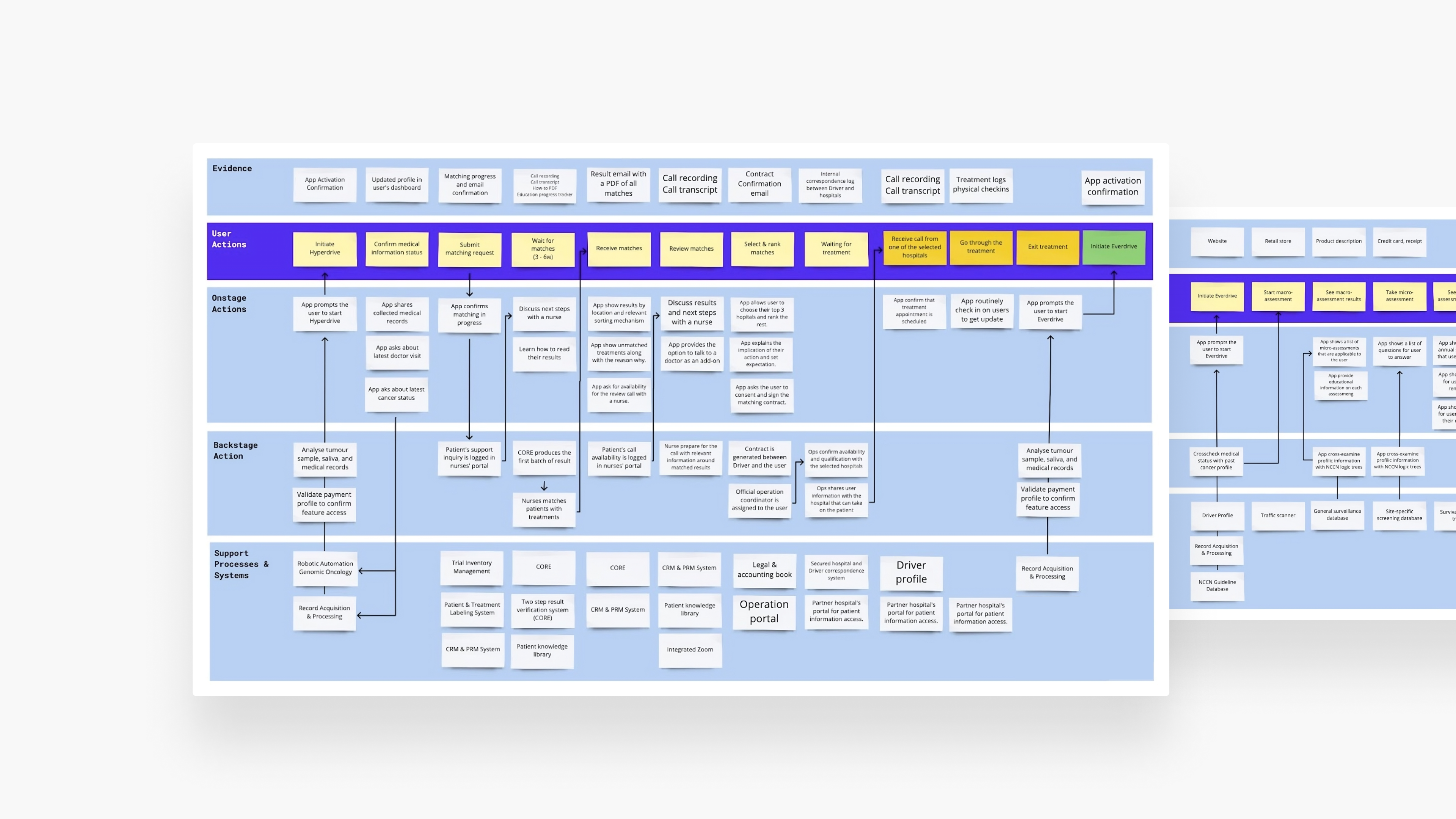
Developing service blueprints
Driver offers two key services: Treatment Matching and Ongoing Care. Treatment Matching allows patients to connect with numerous clinical trials at partnered institutions from home. Ongoing Care offers post-remission monitoring and screening to prevent cancer recurrence.
To ensure seamless integration between Driver's online and offline touchpoints, I conducted Service Blueprint workshops with their PMs, engineers, operational specialists, and nurses. The result was two comprehensive service blueprints for Treatment Matching and Ongoing Care, clearly delineating all onstage and backstage actions, as well as the supporting systems necessary for every user action.
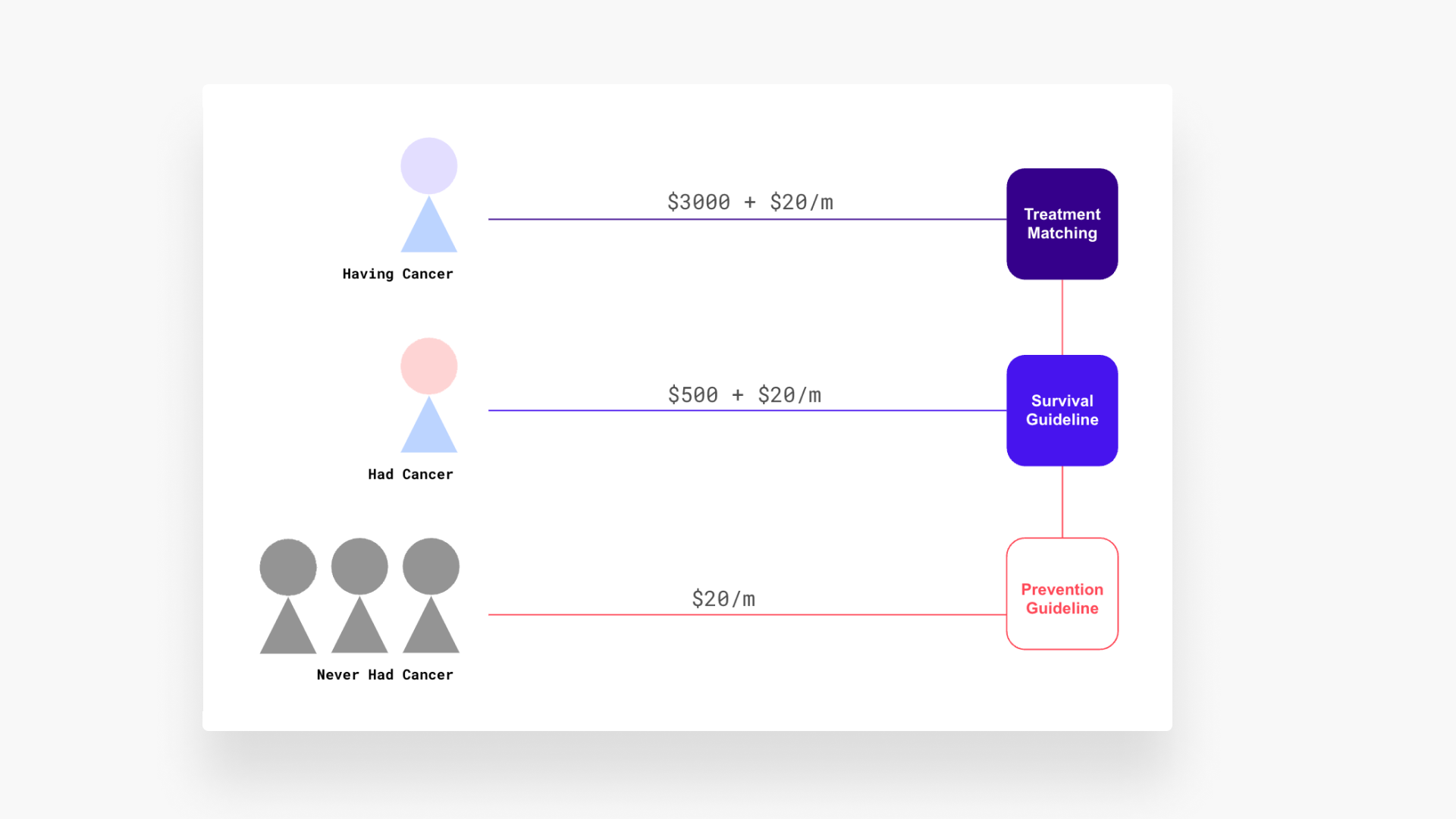
Designing a new revenue model
Driver already had a subscription model in mind: a $3,000 one-time activation fee, plus $20/month for Treatment Matching during cancer treatment, transitioning to free Ongoing Care post-treatment. For previous cancer patients, the model was a $500 activation fee and a $20/month fee for Ongoing Care.
However, our field research revealed a new opportunity. Conversations with families of cancer patients indicated a heightened awareness of their own health risks.
In response, we developed an insurance model, introducing a lite version of the Ongoing Care, named Preventative Care, at $20 per month. It offers general preventative guidelines and screening schedulers. Once enrolled as a Driver member, individuals receive complimentary access to Treatment Matching or Ongoing Care should they need it in the future.
Finding the UX insight
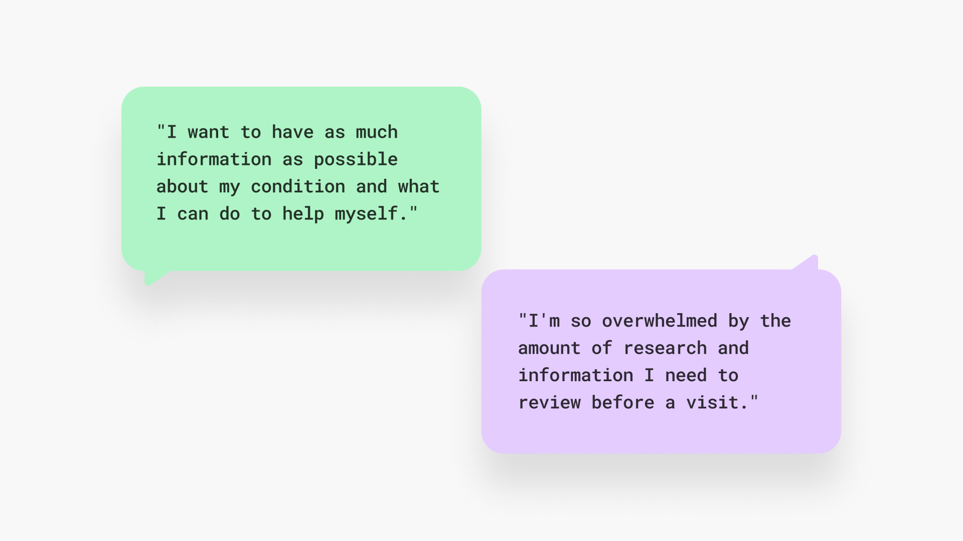
During our UX research, a critical insight emerged:
Dealing with cancer involves a constant struggle between a desire for control and a feeling of being unequipped.
Patients often want comprehensive information about their health and treatment options, yet they can feel overwhelmed and unprepared to act on this information.
Our design challenge was to balance these two user needs while maintaining an approach of 'expert guidance.' This entails providing advice and direction as a doctor would to a patient, rather than merely fulfilling user wishes.
Architecting the app's IA
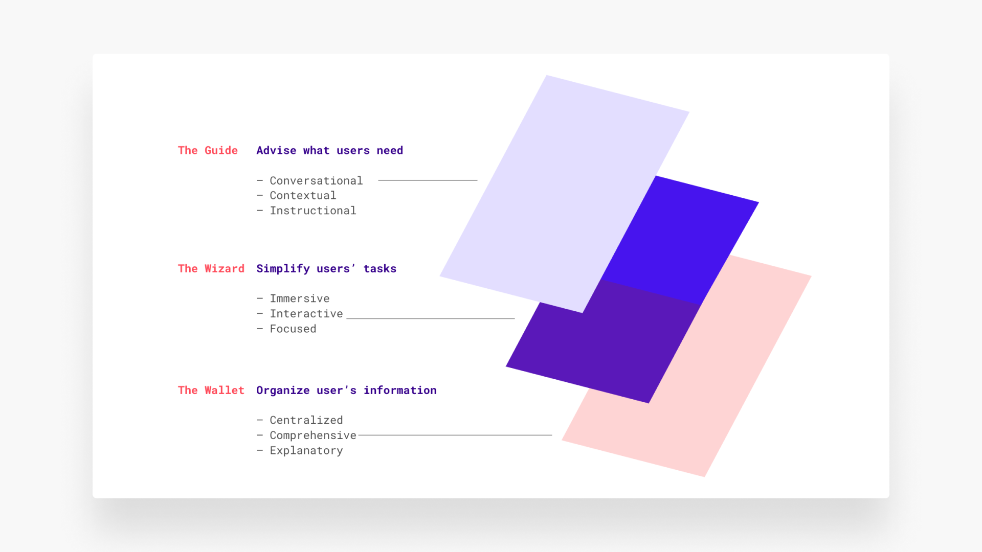
In response to the design challenge, we conceptualized a three-leveled architecture, catering to the varying needs and cognitive capacities of users:
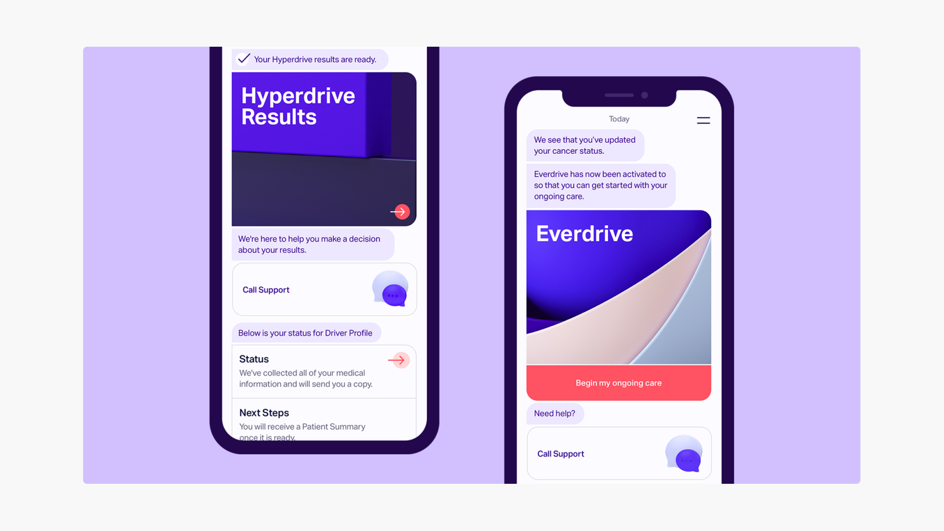
The Guide
Advising users on what they need to know and do at any given moment, ensuring they receive essential information and guidance.
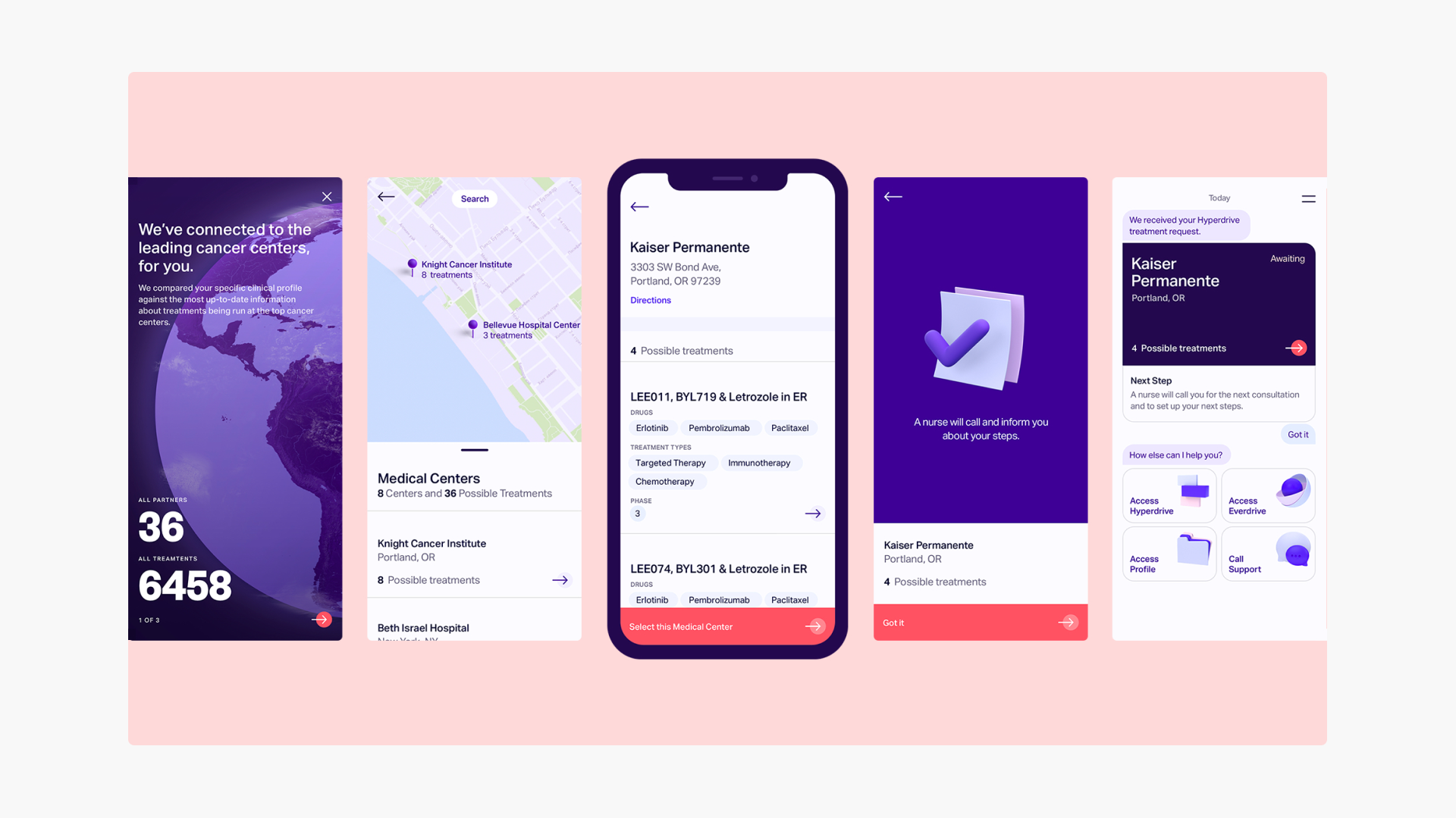
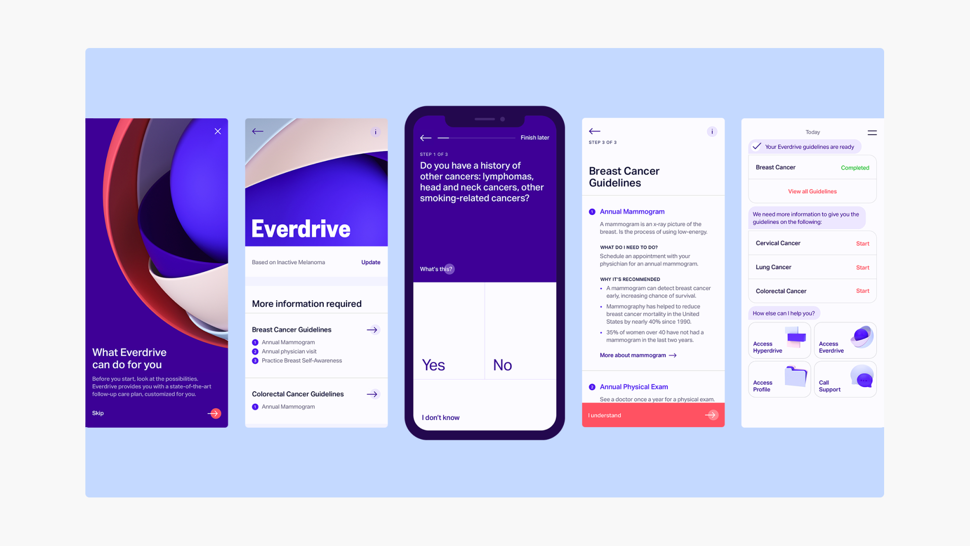
The Wizard
Assisting users in navigating complex tasks. It's particularly useful for filling out lengthy forms or answering detailed health screening questions.
The Wallet
Centralizing and organizing all user data, including interactions with The Guide, The Wizard, and exchanges with Driver and affiliated hospitals.
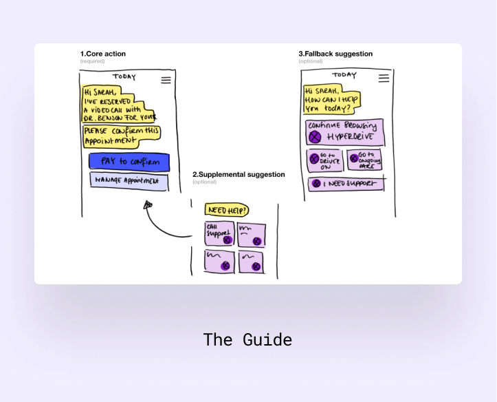
Advising users on what they need to know and do at any given moment, ensuring they receive essential information and guidance.
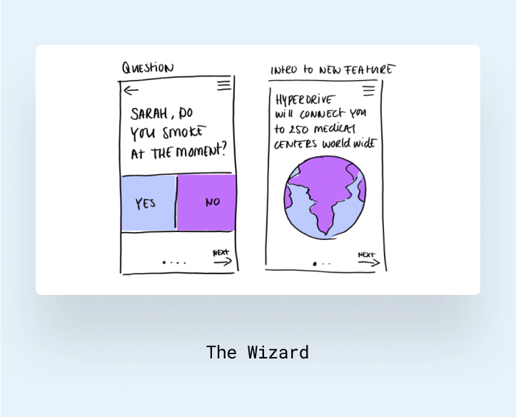
Assisting users in navigating complex tasks. It's particularly useful for filling out lengthy forms or answering detailed health screening questions.
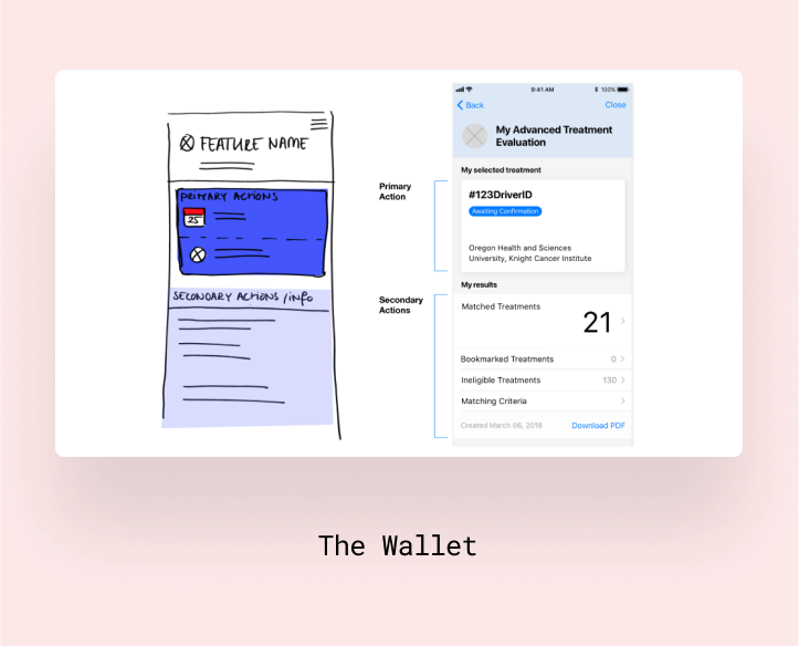
Centralizing and organizing all user data, including interactions with The Guide, The Wizard, and exchanges with Driver and affiliated hospitals.
Understanding our impact
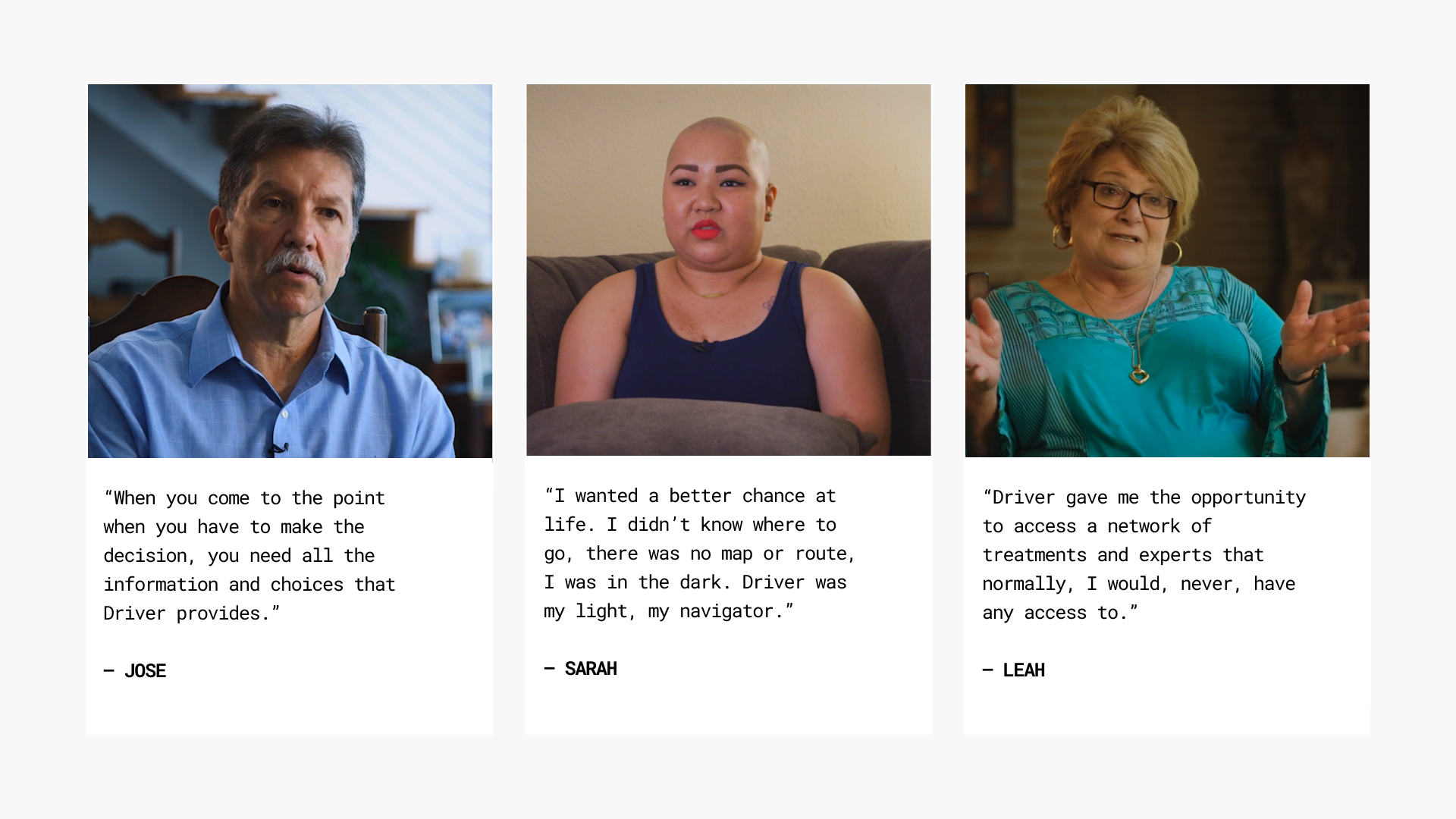
Driver's launch was met with considerable positive feedback from both patients and the media. During the lead-up and throughout our launch month in the US and China, we were touched by numerous heartfelt anecdotes from early adopters who underwent treatments. These patients credited Driver with playing a significant role in saving their lives. Additionally, we received stories from many who expressed appreciation for the availability of a product like Driver in the market.
A lesson for startups
A few months after launch, Driver shut down their business, citing an poorly-managed runway as the result. While there are many contributing factors to the fall of Driver, three notable ones which I observed from our involvement with Driver are: